PROJECT - 2024
Bliss Mobile App
Individuals passionate about meditation and yoga need a platform to create and join events, connect with like-minded communities, and engage with experts, enabling them to deepen their practice and enhance their wellness journey.
“How might we design an app that enhances meditation and yoga practices by enabling users to create and join events, connect with like-minded individuals, and build a supportive community?”
ROLE
UI / UX designer of concept Bliss
11.2023 - 08.2024
PROCESS
Research, interviews, competitive analysis, ideation, prototyping, testing, evaluation
TOOLS
Figma, UsabilityHub, Optimal Workshop
In this video, I walk through main features of Bliss
PROBLEM
Our wellbeing users need a way to help them cope with daily stress situations, which they can access easily at any time, because they want to balance work and life as well as their mental and physical health. We will know this is true when we see that users embrace our app, actively seeking to enhance their mindfulness about both mental and physical well-being in their day-to-day experiences.
RESEARCH & COMPETITIVE ANALYSIS
CALM
Calm's slogan was "Take a Deep Breath." his slogan aligns with the app's focus on mindfulness, relaxation, and stress reduction through practices such as guided breathing exercises and meditation.
Calm focuses on offering a comprehensive mindfulness solution through its user-friendly mobile app. Calm maintains a 4.5-star on the Google Play app store out of 556.000 overall ratings. 4.7 stars in Apple Store. Approximately five million users
Calm: Apple's 2018 Award Winner and 2023 App of the Year, dubbed Happiest App by Center of Humane Technology; New York Times ranks it top 4 in meditation apps. With global expansion and multi-language support, it fosters mindfulness through features like 'Daily Calm,' integrating seamlessly into users' routines.
Calm shares mental health and mindfulness content across platforms, establishing authority. Leveraging influencers broadens reach, tailored marketing to diverse audiences expands user base, while event participation boosts visibility.
User Interviews
INSIGHTS & AFFINITY MAPPING
Headspace's mission is to provide every person access to lifelong mental health support. Through evidence-based meditation and mindfulness tools, mental health coaching, therapy, psychiatry, Headspace helps create life-changing habits to support mental health.
A quick Google search for "headspace" reveals that it has high visibility in the media.Headspace also successfully uses partnerships to expand its user base.Headspace maintains a 4.5-star rating on the Google Play app store out of 309.000 overall ratings and 4.8 star rating on Apple.
Headspace stands out with themed meditation packs, interactive content, and a distinctive brand identity. Its global availability and diverse content foster inclusivity and earned it an Editor's Choice Award.
Headspace leverages various advertising channels and partnerships with companies like Amazon, Netflix, and Nike to reach a vast audience. Partnerships include creating curated content for employees and collaborating on mindfulness series like 'Headspace Guide to Meditation' on Netflix.
I conducted user interviews with 4 participants, asking 12 questions each in sessions lasting 20-30 minutes.
Some users face obstacles in creating any regular habits or routines.
Users should not view mental health apps as an extra burden or obligation.
Beyond meditation, there are countless other options for relaxation.
Personalized content suggestions can help the app stand out and foster stronger user connections, creating a unique and engaging experience.
The tone and delivery of the meditation guide significantly influence the experience.
While notifications serve as a source of motivation for some individuals, others may not find them effective
As individuals advance in their meditation practice, they tend to rely less on a meditation app over time.
To avoid confusion, brief information should be provided, especially for beginners
Some users prefer to have physical activities in addition to relaxation exercises (Yoga, stretching etc.)
It is important to have a section to save content so that they can easily access it later.
Certain individuals prioritize flexibility for personal time throughout the day, while others prefer implementing structured morning and evening schedules.
There are those who lean towards lesser-known apps rather than the widely popular ones.
Individuals find it beneficial to have a platform where they can visually track their mood and personal progress.
Excessive paid content within apps often acts as a deterrent for users.
HEADSPACE
MEET THE USERS: PERSONAS, TASK FLOWS, JOURNEYS
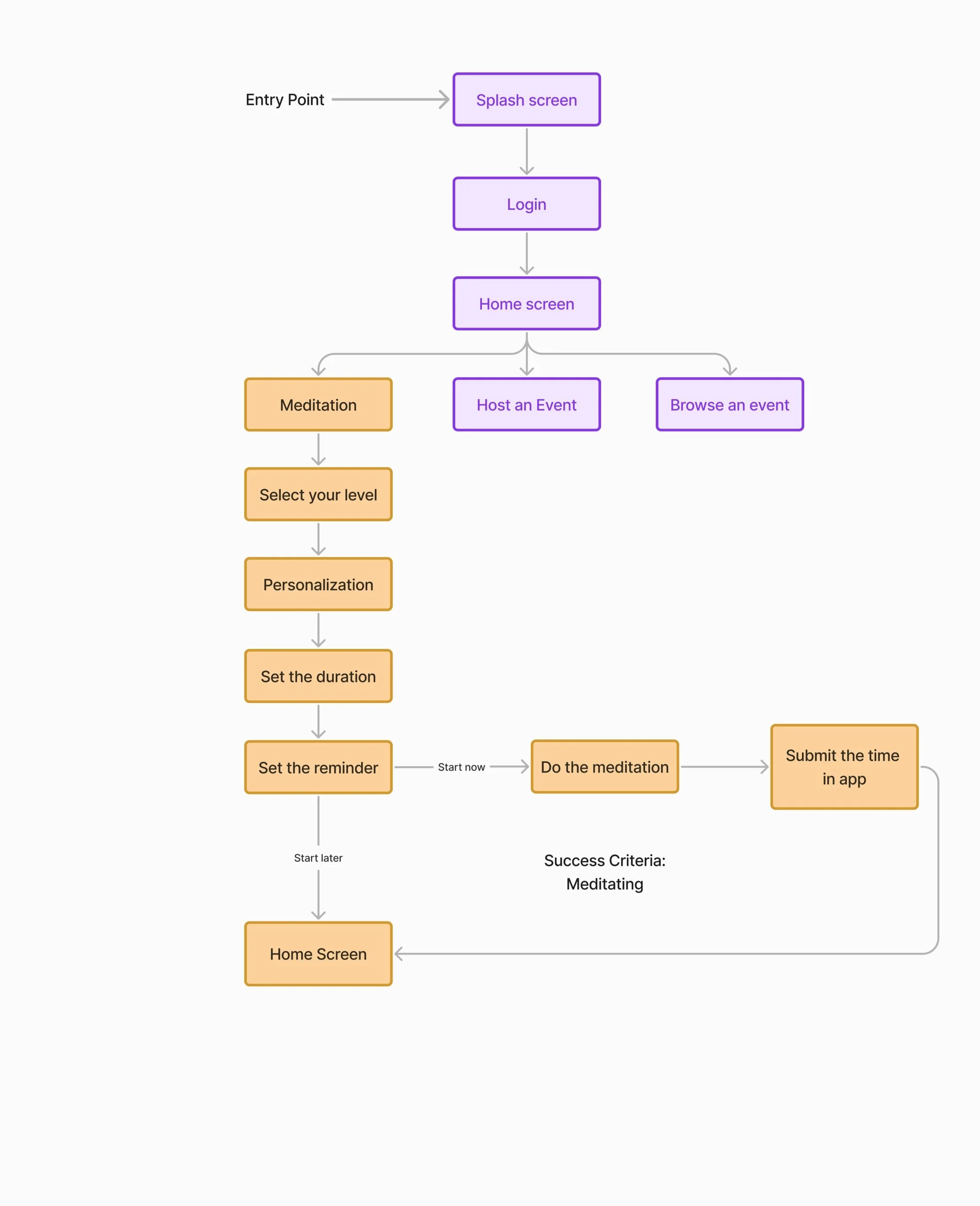
In addition to my above research, user stories, scenarios and task flows helped me prepare for the wireframing process.
The Insights I gathered during my research helped me develop three personas:
Task Flows
Mental Models
CARD SORTING & SITEMAP
After creating the initial sitemap for the Bliss app, I conducted a remote card sorting exercise using Optimal Workshop. This approach allowed me to collect valuable insights from users, which informed a refined sitemap that better aligns with their mental models and enhances overall navigation intuitiveness.
WIREFRAMES
I designed the Bliss app to empower users in their journey toward well-being by offering them the tools to create and participate in personalized wellness events. Users can effortlessly organize their own yoga sessions, meditation circles, or mindfulness workshops, inviting others to join and fostering a sense of community. Additionally, Bliss features a rich library of guided meditation audios, allowing users to access calming practices anytime, anywhere. The app is a nurturing space where individuals can cultivate mindfulness, connect with like-minded people, and take charge of their holistic health.
USABILITY TESTING
I mocked up an Interactive Prototype using Figma. Six usability tests were conducted, with one test in person and the remaining five conducted remotely.
Task 1: From the Bliss home screen, find the section where you can create your own event and share your experiences.
Task 2: Find and navigate to the section where events are listed.
Task 3: You are feeling stressed. Please find and start a meditation session for stress relief.
Usability Test Reports
Based on the results of usability testing, I implemented several improvements.
USER INTERFACE DESIGN
Bliss was meticulously designed to serve as a sanctuary for those seeking to enhance their well-being through meditation and community-driven events. The name "Bliss" was chosen to evoke a sense of inner peace and happiness, which are the core experiences the app aims to deliver.
During user testing, I discovered that simplicity and ease of use were crucial for our audience, many of whom were new to digital wellness tools. This insight guided the design process, leading to an interface that is both intuitive and serene, ensuring that users can focus on their mindfulness practices without distraction.
Initially, the design concept for Bliss was vibrant and filled with intricate details meant to inspire. However, as the design process unfolded, it became clear that a more minimalist and calming aesthetic would better serve our users. I opted for a soft, natural color palette and clean lines, reflecting the tranquility that users seek when using the app.
Bliss was also designed to be inclusive and accessible to a broad range of users. Recognizing the diverse needs of our community, I implemented features such as customizable event settings, varied meditation audio options, and seamless navigation. This ensures that whether users are organizing a large public event or enjoying a quiet meditation session, Bliss adapts to their needs effortlessly.
From a strategic standpoint, Bliss was conceived to go beyond just a meditation tool; it is a platform for building connections. By enabling users to create and join wellness events, the app fosters a sense of community and shared purpose, making it more than just a personal tool, but a collective experience aimed at enhancing well-being on a broader scale.

Access the style guide for Bliss below, created by Figma.
Hypotheses
Chat Feature with Event Owners:
Our hypothesis is that enabling users to chat directly with event owners will enhance user satisfaction and increase event participation. The problem is that users may have questions or need assistance from event organizers that are not currently addressed. By introducing a chat feature, we propose that users can easily communicate with event owners for help or inquiries.
Distinct User Experiences for Joiners and Hosts:
Our hypothesis is that creating separate experiences for users who primarily join events and those who host events will improve user satisfaction and usability. Currently, both types of users have access to the same features, which may lead to confusion and inefficiency. By differentiating the user experience from the start—such as displaying tailored features and interfaces for each user type—we propose to make the app more intuitive and relevant for each group.
Comprehensive Mood Tracking Dashboard:
Another hypothesis is that providing a dashboard that shows users their meditation mood trends and time spent meditating over a month will improve user motivation and engagement. Users currently lack visibility into their long-term meditation patterns. By offering a detailed dashboard, we propose that users will have better insights into their meditation habits, leading to increased motivation and consistent practice.
Event Owner Confirmation System:
Introducing a system where event owners can confirm or reject participants is another hypothesis. The problem here is that event owners may lack control over who joins their events. By implementing a confirmation system, we propose to give event owners better oversight and management capabilities.
What I’ve learned…
Empathy and User-Centered Thinking: Developed a deep understanding of the importance of empathy in design. Learned to prioritize users' perspectives, needs, and pain points to create solutions that genuinely address their concerns.
Research and Analysis: Gained expertise in various research methods, such as user interviews, surveys, and usability tests, enabling me to analyze user behavior and gather insights to inform design decisions.
Information Architecture: Mastered the principles of organizing and structuring content effectively. This includes creating and refining sitemaps, conducting card sorting, and designing user flows to enhance navigability.
Wireframing and Prototyping: Learned to translate design concepts into wireframes and interactive prototypes, facilitating early-stage testing and validation of ideas to refine user interactions.
Design Thinking: Embraced a mindset of continuous problem-solving through ideation, prototyping, and iterative testing, fostering innovative solutions to complex design challenges.
Usability and Evaluation: Became proficient in evaluating designs through heuristic reviews and usability testing, identifying areas for improvement to optimize user experience.
Accessibility Awareness: Learned best practices for designing inclusive and accessible interfaces, ensuring that all users, regardless of their abilities, can interact with and benefit from the design.
Tool Proficiency: Developed practical skills in key UX tools such as , Figma, Miro, and Optimal Workshop, essential for designing, prototyping, and conducting user research.
What was the challenge…
During the development of the Bliss app, I faced a multifaceted challenge involving the sitemap, UI design, and accessibility. While user flows were clear and understandable, the sitemap required refinement, and the UI design presented several accessibility issues.
Challenge Details:
Sitemap Optimization: The initial sitemap was complex and needed simplification to improve user navigation and content organization.
UI Design Complexity: The interface was visually cluttered, with inconsistent styles that hindered user focus and navigation.
Accessibility Concerns: Ensuring the app was accessible to all users, including those with disabilities, required addressing issues such as color contrast, text readability, and interactive element accessibility.
Approach to the Challenge:
Sitemap Refinement:
Conducted a Card Sorting Exercise: Used Optimal Workshop for remote card sorting to gather user insights on content organization and improve the sitemap structure.
Simplified and Organized: Revised the sitemap to create a more intuitive and user-friendly structure, reducing complexity and enhancing navigability.
UI Design Improvements:
Unified Visual Style: Redesigned UI elements to achieve a consistent and cohesive visual style, improving layout clarity and focus.
Enhanced Readability: Improved text size, spacing, and visual hierarchy to ensure that key elements were easily distinguishable and accessible.
Accessibility Enhancements:
Utilized the Stark Plugin: Employed the Stark plugin to perform accessibility audits and address issues related to color contrast, text readability, and interactive elements.


